Essential Steps to Design Website
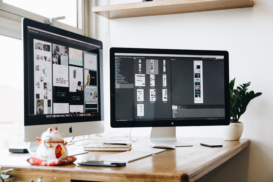
Table of Content.
- Why Design Matters
- Understanding Your Audience
- Choosing the Right Platform
- Essential Design Elements
- Mobile Responsiveness
- SEO Best Practices
- Testing and Launching Your Website
Why Design Matters
Design is like the face of a website. It's what users see first. A well-designed site can grab attention right away. It tells visitors they're in the right place.
Think about visiting a website that looks messy. You might leave quickly. Good design helps people find what they need. It's about making things easy to understand.
Colors, fonts, and images all play a role. They create a feeling or mood. For example, a bank's website might use blue to show trust. A fun site might use bright colors.
Design isn't just about looks. It's about function too. A clean layout guides users without confusion. Buttons should be easy to find. A search bar should be visible.
Design influences trust. A site that looks professional feels reliable. People are more likely to stay and explore. Good design also affects how users interact. It can lead to more sales or sign-ups.
In short, design matters because it connects users with the content. It makes the online experience smooth and enjoyable.

Understanding Your Audience
Creating a design website starts with knowing who will use it. Imagine you're setting up a coffee shop. You'd want to know if your customers prefer espresso or lattes, right? The same goes for websites.
Begin by identifying your audience's age, interests, and online habits. For instance, if your website is for young gamers, bright colors and interactive features might attract them. On the other hand, a website for professionals might benefit from a clean and formal layout.
Gather data through surveys or social media polls. Ask questions about their preferences and what they find helpful online. This information guides how you design your website to meet their needs.
Consider using analytics tools to track how users interact with your site. Observing which pages they spend time on helps you understand what captures their interest. By focusing on your audience, you ensure the website creation process aligns with their expectations, making it more engaging and effective.
Choosing the Right Platform
When you're ready to design a website, selecting the right platform is crucial. It sets the tone for your entire project. But with so many options out there, how do you choose? Let's break it down.
First, think about what you need. If you're building a small personal blog, a simple platform like WordPress could be ideal. It's user-friendly and has plenty of plugins to expand functionality. For e-commerce websites, Shopify or WooCommerce might be better choices. These platforms are tailored for online stores, offering tools for payment processing and inventory management.
Consider the technical side too. Are you comfortable with coding? If not, website builders like Wix or Squarespace offer drag-and-drop features, making it easy to create a website without technical skills. On the other hand, if you or your team has coding experience, platforms like Joomla or Drupal might provide more flexibility.
Cost is another important factor. Many platforms offer free basic plans, but premium services often require monthly fees. Evaluate your budget to ensure you choose a platform that fits your financial plan.
Lastly, think about scalability. As your website grows, will the platform grow with you? Check for options that allow for easy upgrades or additional features in the future. This way, your website can adapt to changes and keep up with your needs.

Essential Design Elements
When you design a website, certain elements play a major role. These elements help create a user-friendly and visually appealing site. Let's explore what these elements are and how they work.
First up is layout. A layout is like the structure of your website. It decides where things go on the page. A good layout is simple, making it easy for users to find what they need. Think of it as a map that guides visitors through your site.
Next, colors are key. Colors set the mood and feel of your website. Choosing the right colors can make your site look modern or classic. For example, a tech website might use blue for a clean and professional look. A website for kids might use bright colors to make it fun.
Typography is all about the fonts you use. Fonts should be easy to read. They also need to match the style of your website. A fancy font might look nice, but if it's hard to read, visitors will get frustrated.
Images and graphics bring your site to life. They grab attention and explain things without words. High-quality images make your site look more professional. But remember, too many images can slow down your site.
White space is the empty space between elements. It gives your website a clean and organized look. White space helps users focus on what's important without feeling overwhelmed.
Finally, navigation is how users move around your site. Good navigation is simple and direct. It should be easy for visitors to find the information they want without getting lost.
These elements together create a website that is both functional and pleasing to the eye. Each part plays a role in making sure your visitors have a great experience.
Mobile Responsiveness
Mobile responsiveness is crucial for any design website. Many people use smartphones and tablets to browse the internet. If your website creation website is not mobile-friendly, you risk losing visitors. A responsive design ensures that your site looks good on all devices. It adjusts the layout based on the screen size, whether it's a phone, tablet, or desktop.
Think of responsive design like water in a container. Water takes the shape of the container it's in. Similarly, a responsive website adapts to the device it's viewed on. This flexibility is key to providing a good user experience.
One way to achieve mobile responsiveness is through fluid grids. These grids use relative units like percentages instead of fixed units like pixels. This approach allows elements to resize according to the screen. For example, if you have a three-column layout on a desktop, it might change to a single column on a mobile device.
Media queries are another tool. They apply specific styles to devices based on their characteristics, like screen width. This way, you can hide or show elements depending on the device. For example, a large banner image might be hidden on a small screen to save space.
Responsive images are also important. They ensure that images load quickly and look sharp. You can use different image sizes for various devices. A smaller image size can load faster on a mobile device than a larger one meant for desktops.
Testing your design on multiple devices is vital. Use tools or simulators to check how your site appears on different screen sizes. This step helps identify any issues before your site goes live.
Mobile responsiveness is not just a trend. It's a necessity. A site that works well on any device keeps visitors happy and engaged. If you want your design website to succeed, making it mobile-friendly is a step you can't skip.
SEO Best Practices
When creating a design website, SEO is a crucial element to consider. SEO, or Search Engine Optimization, helps your site appear in search results. The better your SEO, the higher your website will rank on search engines like Google. Let's break down some best practices to help your website shine.
Start with keyword research. Keywords are the phrases people type into search engines. Use tools like Google Keyword Planner to find relevant keywords. Once you have a list, sprinkle them naturally throughout your content. But remember, don't overdo it. Keyword stuffing can harm your site's ranking.
Next, focus on quality content. Search engines love fresh, engaging, and informative content. Write articles, blog posts, or guides that answer questions or solve problems for your audience. Quality content keeps visitors on your site longer, which can improve your SEO ranking.
Another practice is optimizing your images. Use images that are relevant and of high quality. Make sure to use descriptive filenames and alt text. Alt text helps search engines understand what an image is about, and it also improves accessibility for visually impaired users.
Don't forget about mobile optimization. Many people browse the internet on their phones. A mobile-friendly design is essential. Ensure your website loads quickly and is easy to navigate on smaller screens. A responsive design can boost your SEO as search engines prioritize mobile-friendly sites.
Internal linking is another useful tactic. Link to other pages on your website within your content. This helps search engines crawl your site and improves user navigation. It can also keep visitors on your site longer by encouraging them to explore more of your content.
Lastly, pay attention to your website's loading speed. A slow site can frustrate users and cause them to leave. Use tools like Google PageSpeed Insights to check your site's speed and get tips on how to improve it. Fast-loading sites provide a better user experience and can positively impact your SEO ranking.
By following these SEO best practices, your design website can attract more visitors and rank higher in search results.

Testing and Launching Your Website
Testing your website is like giving it a thorough check-up before the big debut. It's crucial to ensure everything works as it should. Start by checking all the links. Broken links can frustrate users and make your site look unprofessional. Use online tools that scan your website and point out any broken links.
Next, take a close look at your website's design on different devices. People use a range of gadgets, from smartphones to tablets and desktops. Your site should look good and function well on each. This is called responsive design, and it's a big deal. A responsive website keeps visitors happy and engaged.
Don't forget about the speed of your site. Slow-loading pages can cause users to leave before they even see your content. Use tools to measure your site's speed and identify areas for improvement. Sometimes, compressing images or optimizing code can make a big difference.
Testing for errors is another important step. Look for typos, missing images, or any strange behavior on your site. Get a fresh pair of eyes by asking someone else to navigate your website. They might spot issues you missed.
Security is key when you prepare to launch. Make sure your website is safe from hackers. Use strong passwords and consider an SSL certificate. This keeps data secure and builds trust with visitors.
Finally, plan your launch carefully. Choose a time when your audience is most active. Announce it on your social media channels and send out emails to create buzz. A well-planned launch can attract visitors and make your website a success right from the start.
FAQ
Why is website design important for user experience?
Website design significantly impacts user experience by making navigation intuitive and content accessible. A visually appealing layout can draw users in, keep them engaged, and encourage them to explore further, which is essential for retaining visitors and converting them into customers.
How can I identify and understand my target audience for better website design?
To understand your target audience, conduct market research, create user personas, and gather feedback from potential users. This information helps tailor your website design to meet the specific needs, preferences, and behaviors of your audience, ensuring a more effective user experience.
What factors should I consider when choosing a website platform?
When choosing a website platform, consider factors like ease of use, customization options, scalability, cost, and the specific features you need. Popular platforms include WordPress, Shopify, and Wix, each catering to different types of websites and user requirements.
What are some essential design elements I should focus on?
Key design elements include color schemes, which should align with your brand identity; typography, which should be legible and consistent; and layout, which should be clean and organized. These elements collectively contribute to an aesthetically pleasing and functional website.
Why is mobile responsiveness critical, and how can I ensure my website is mobile-friendly?
Mobile responsiveness is crucial as more users access websites via mobile devices. A mobile-friendly design ensures your website adapts to different screen sizes, providing a seamless user experience. Use responsive design techniques and test your site on various devices to ensure compatibility.
What SEO practices should I integrate into my website design?
Integrate SEO practices like optimizing page load speed, using descriptive meta tags, incorporating keywords naturally throughout your content, and ensuring your site is easy to navigate. These practices help improve your website's visibility in search engine results, driving more traffic.
How should I test my website before launching it?
Before launching, test your website for functionality, usability, and performance. Check all links, forms, and interactive elements, ensure the design is consistent across devices, and optimize load times. Conduct user testing to gather feedback and make necessary adjustments for a smooth launch.